Using Essence Dashboard
Over the last decade, radiology departments have been shifting from film-based solutions to PACS systems. These systems provide many benefits, but have also grown increasingly complex over time. Computer system administrators are faced with the challenge of coordinating hardware, software, and network infrastructure to support a more complex Workflow. At the same time, radiologists are under pressure to provide efficient, quality service in less time. This can lead to potential information overload. Radiologists and administrators need to operate within tight deadlines and manage these complex systems, but lack the tools to efficiently and effectively monitor these systems in real time.
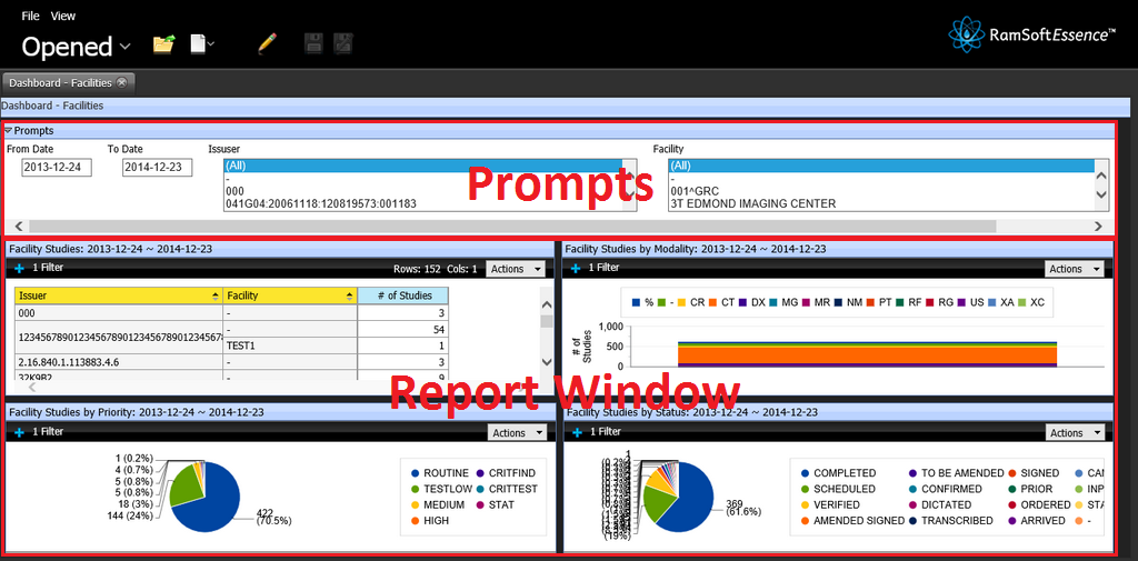
Dashboards can help address this problem in radiology by displaying key metrics that allow for quick assessments on the state of the system. Dashboards give radiologists and administrators real-time, context specific information allowing for optimized decision making. The Dashboard displays critical data regarding all studies assigned to different Reading Physicians of the organization. It provides a snapshot of the different studies with various priorities in each facility and various graphs displaying the number of unread studies per facility. These graphs provide a visual overview of the total number of studies in each study status for the current day. The Dashboard display the number of appointments in each appointment state (i.e. Confirmed, Arrived etc). The data can be exported in Excel format.
Information for the dashboard is retrieved from the database at a regular interval, which is configurable in the dashboard setup in maintenance. The contents of the Dashboard are a legal record and cannot be removed or edited.
The Dashboard application can be accessed by clicking the Essence icon  on the Login page.
The Dashboard is a data visualization tool that displays a collection of analysis reports which can be viewed at once. This tool is interactive, allowing an authorized user to drill down into particular aspects and explore. A sample screen of a dashboard is displayed below.
The dashboard can be customized for a better visual presentation with various templates, themes, and properties.
Click the Edit Content ![]() icon. The application displays a layout as shown below.
icon. The application displays a layout as shown below.
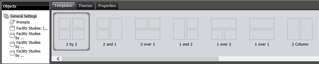
Templates:
This template renders 13 different types of templates. The user may select any one of the template as per the business requirement or for better visual presentation. Each template is unique and has one or more report windows each with a different orientations.
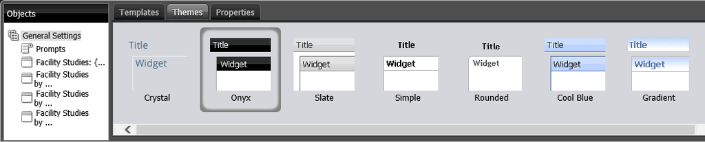
Themes:
This template renders eight different types of themes. The user may select any one of the themes for better visual presentation. Each theme is unique with different colors and shapes as shown below.
Properties:
The user can rename the page title, set the time interval how often the page should get refreshed automatically and you may adjust the size of each report window individually to accommodate the data and graphs accordingly.

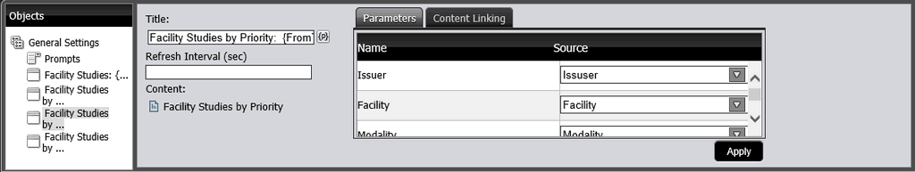
By clicking the ![]() icon, the application opens the layout view. By associating the prompts and filters in this view, the filter values can be modified by prompts. When the user modifies the prompt values, the dashboard displays data and graphs accordingly.
icon, the application opens the layout view. By associating the prompts and filters in this view, the filter values can be modified by prompts. When the user modifies the prompt values, the dashboard displays data and graphs accordingly.